I have just seen a broadly positive article about 12.04
http://lunduke.com/?p=2813
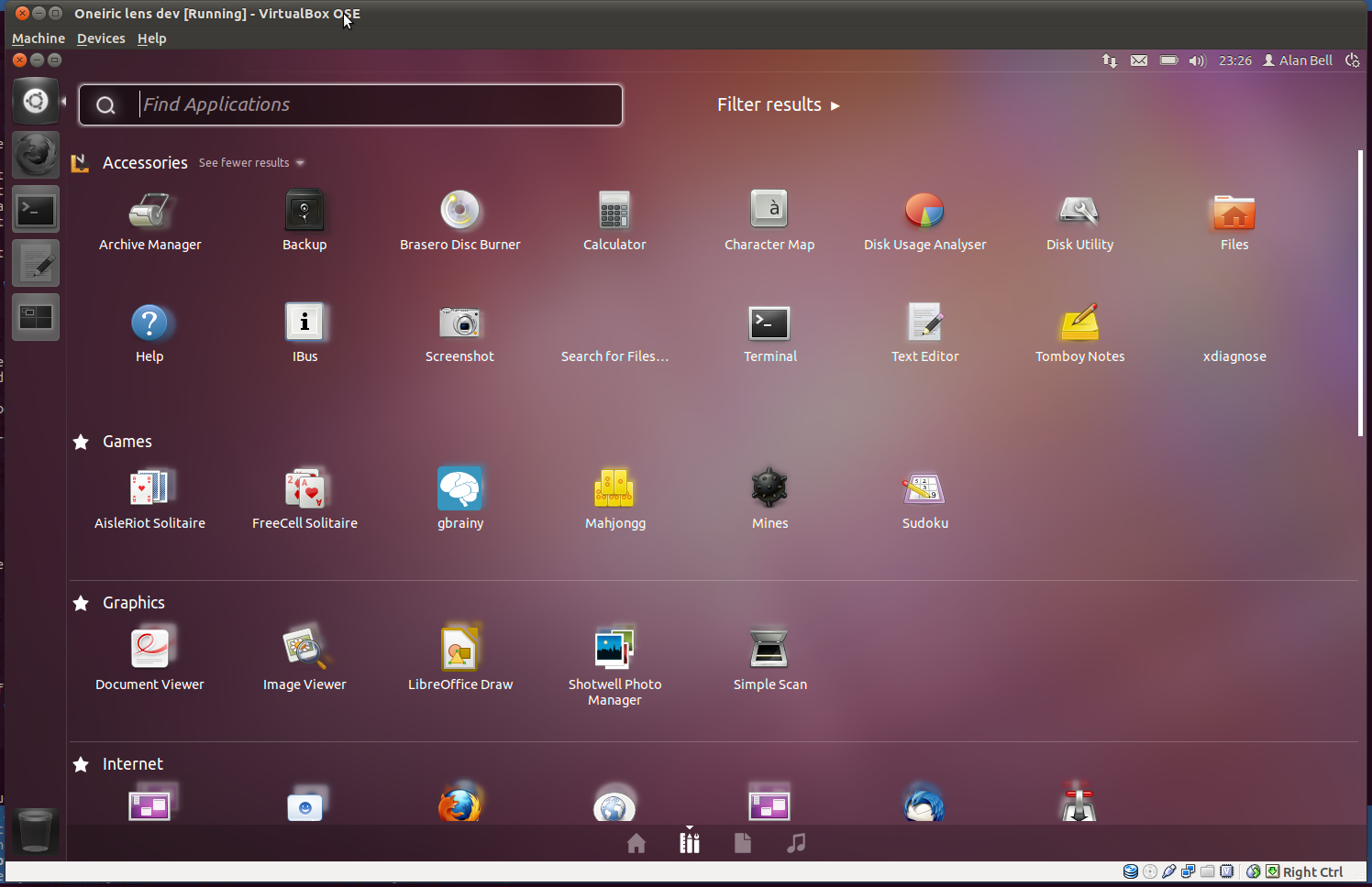
but it picks up on the really odd setup of the applications lens. Why on
earth do we use the categories as filters and not as categories?
It just makes much more sense, it looks better it makes applications
more browsable and easier to find
http://people.ubuntu.com/~alanbell/appmenulens.png
It really isn't nice to just have a wall of 200 icons in the "installed"
category.
Alan.

--
The Open Learning Centre is rebranding, find out about our new name and look at
http://libertus.co.uk


--
Mailing list: https://launchpad.net/~unity-design
Post to     : unity-design@lists.launchpad.net
Unsubscribe : https://launchpad.net/~unity-design
More help   : https://help.launchpad.net/ListHelp