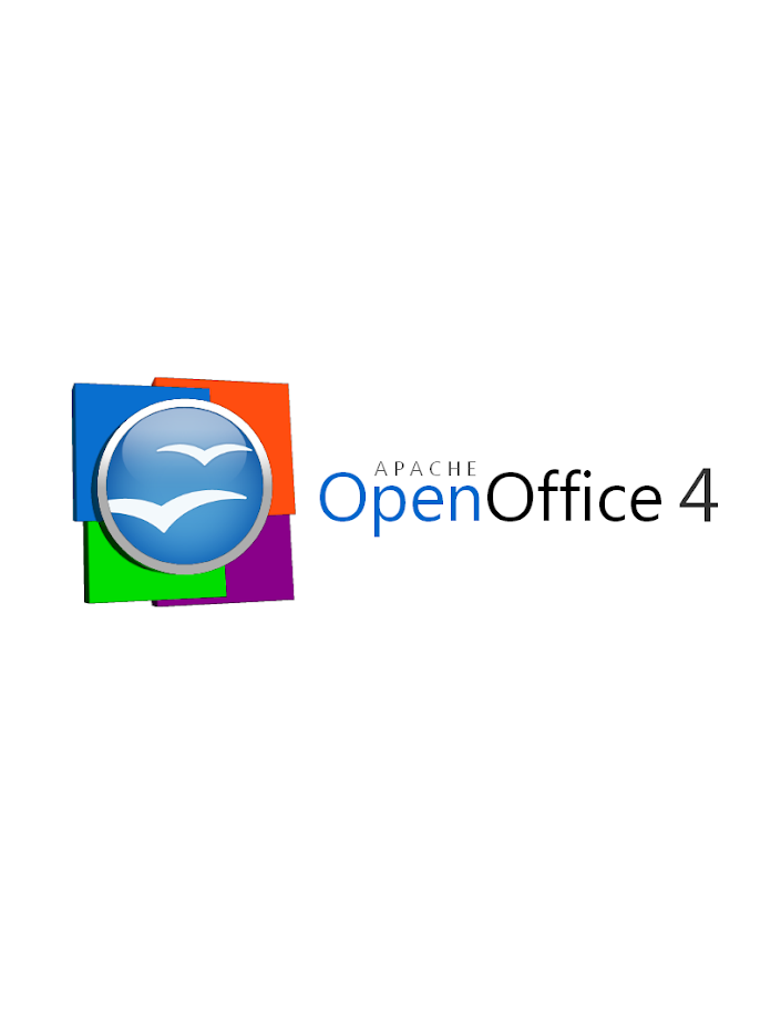
My general consensus based on all the comments...

   1. I think that there is no need to change the current OpenOffice orb
   because of two reasons. The first the current design it's the best logo
   that the project put forward since its inception and actually gave the
   project logo a "premium" feel and has become the user's neumonic device to
   identify the AOO project (OpenOffice in general). The second reason is that
   the current logo design is simple, modern, and easy on the eyes, the only
   way I can think to improve the orb is by adding a bezel which to me fits
   nicely because it represents an office suite
   that brings together everything you'll need to get the job done.
   2. As for the application squares, I think we have something here that
   can be changed maybe the issue is with the shape. Let's see what I can
   think off...
I plan to have further proposals shortly.

Again thanks to all the positive feedback on the logo.


On Thu, Dec 20, 2012 at 9:41 AM, janI <[email protected]> wrote:

> On 20 December 2012 15:28, RGB ES <[email protected]> wrote:
>
> > 2012/12/20 janI <[email protected]>
> >
> > > I am also no desgner, and like the more fresh look.
> > >
> > > However I showed to a friend visiting, and the first reaction
> was..."oooh
> > > AOO is already ready for windows8", it seems that the 4 squares (not
> > > identical) are used quite a lot inside windows8.
> > >
> >
> > Indeed, this is a problem: even if last time I used a windows machine was
> > several years ago the immediate reaction to the squares was "this looks
> > like a MS logo" (the rest of the logo is just fine).
> >
> > A different approach could be the use of a gradient instead of the blue
> for
> > the orb fill: let the orb with its actual shape, no metal border and no
> > squares, but fill it with a gradient that displays all the colours of AOO
> > apps.
> >
> > (The image is clear on my mind, but I lack the skills to build it).
> >
> > On a related note: another image clear in my mind is a version of the orb
> > build not with a continuous background, but with small text written on
> > several languages and several scrips, to stress that AOO is for everyone,
> > on every language. Something like an "ASCII art" logo.
> >
> +1 If that can be done...it would be a winner !!
>
> >
> > Regards
> > Ricardo
> >
> >
> >
> > >
> > > If that is the case, we should change it....maybe not use squares but
> > e.g.
> > > balloons.
> > >
> > > We also have to remember that it must be convertable (or redrawn) as a
> > > favicon, that is only 16x16.
> > >
> > > thanks for taking time to make the proposal, and despite my concerns it
> > is
> > > the best I have seen so far !
> > >
> > > Jan.
> > >
> > > On 20 December 2012 11:02, Jürgen Schmidt <[email protected]>
> wrote:
> > >
> > > > On 12/20/12 6:14 AM, Shenfeng Liu wrote:
> > > > > imacat,
> > > > >   Your comments are so professional! :-)
> > > > >   Personally I like this logo design more comparing to other
> > candidates
> > > > in
> > > > > wiki<
> > > >
> > >
> >
> https://cwiki.apache.org/confluence/display/OOOUSERS/AOO+4.x+-+Logo+Explorations
> > > > >.
> > > > > Thanks Michael!
> > > > >   While we may also want to update the app icon design as the next
> > step
> > > > for
> > > > > consistent L&F...
> > > > >
> > > >
> > > > I think Michaels proposal is the beginning of hopefully more. I
> > > > personally see a reused old orb + some new elements. But the squares
> > > > remind me to windows and the colors don't fit really together from my
> > > > point of view.
> > > >
> > > > We should think about something really new and fresh with or without
> > the
> > > > gulls.
> > > >
> > > > We should think for what OpenOffice and Apache stands for
> > > >
> > > > - free office software for the public good
> > > > - for many million users all over the world
> > > > - many languages
> > > > - ....
> > > >
> > > > We should think about something that can maybe visualize some of
> these
> > > > attributes and can transport the message in one or multiple combined
> > > > graphical elements.
> > > >
> > > > Too bad that I am no designer, but I will try to think about ideas
> and
> > > > will at least share my ideas with you.
> > > >
> > > > Juergen
> > > >
> > > >
> > > > > - Shenfeng (Simon)
> > > > >
> > > > >
> > > > >
> > > > >
> > > > > 2012/12/20 imacat <[email protected]>
> > > > >
> > > > >>     Some honest thoughts:
> > > > >>
> > > > >>      1. These flat 3D plates feel a little weird.  The lights of
> the
> > > > >> plates has the focus effect, but the lights of the plates have
> not.
> > > > >>
> > > > >>      2. I cannot see the connection of these plates with our four
> > > > >> components easily, as the colors of Writer, Calc, Impress and Base
> > are
> > > > >> not Blue, Orange, Green and Purple.  And we have other components
> > such
> > > > >> as Math and Draw.
> > > > >>
> > > > >>      3. The directions of the lights are contradictory.  The
> lights
> > of
> > > > >> the orb come from above, while the lights of the plates (and also
> > the
> > > > >> plate of the orb) come from right.
> > > > >>
> > > > >>     But still, thanks you very much for this great effort.
> > > > >>
> > > > >> On 2012/12/20 09:33, Michael Acevedo said:
> > > > >>> Greetings to the AOO Team!
> > > > >>>
> > > > >>> Hello, after a few months of inactivity I've decided to get back
> in
> > > > touch
> > > > >>> with the AOO community. First, congratulations to the AOO team on
> > > > >>> a successful graduation into a top-level Apache project from the
> > > Apache
> > > > >>> Incubator.
> > > > >>>
> > > > >>> Now the reason on why I am writing this email is to formally
> > submit a
> > > > >> logo
> > > > >>> proposal for the next version of the Apache OpenOffice 4.X logo.
> > > > >>> Previously, I submitted an initial logo on the Apache OpenOffice
> > > > Google+
> > > > >>> community but I went back to the drawing board and created a
> second
> > > > >> version
> > > > >>> of the logo that both pays respect to the previous Apache
> > OpenOffice
> > > > orb,
> > > > >>> but modernizes the look of the overall logo by adding 4 colored
> > > squares
> > > > >>> that represent the four corners of our office suite (Writer,
> Calc,
> > > > >> Impress,
> > > > >>> and Base) and utilizing a streamlined font.
> > > > >>>
> > > > >>> Without further introductions, below I present my official
> > submission
> > > > for
> > > > >>> the Apache OpenOffice 4.X logo.
> > > > >>>
> > > > >>> This first logo, is the proposed official logo for the project
> that
> > > > would
> > > > >>> be used for our webpage and some other materials.
> > > > >>>
> > > > >>>
> > > > >>
> > > >
> > >
> >
> https://lh3.googleusercontent.com/-lETVSrwcgJc/UNJpH6G1sxI/AAAAAAAAABg/JnpNrXdRgUo/s653/AOO%25204%2520LOGO%2520v2-5%2520Small%2520copy.jpg
> > > > >>>
> > > > >>> There's a secondary logo, which is basically the same logo but
> > > changes
> > > > >> the
> > > > >>> proportion of the OpenOffice orb making it better suited for the
> > > splash
> > > > >>> screen that appears at the launch of the application.
> > > > >>>
> > > > >>>
> > > > >>
> > > >
> > >
> >
> https://lh4.googleusercontent.com/-uy8gU24uBZw/UNJpH8UiKiI/AAAAAAAAABk/xfXTQjO8iQg/s912/AOO%25204%2520LOGO%2520v2-2.png
> > > > >>>
> > > > >>> Hope you guys like it and Happy holidays!
> > > > >>>
> > > > >>
> > > > >>
> > > > >> --
> > > > >> Best regards,
> > > > >> imacat ^_*' <[email protected]>
> > > > >> PGP Key http://www.imacat.idv.tw/me/pgpkey.asc
> > > > >>
> > > > >> <<Woman's Voice>> News: http://www.wov.idv.tw/
> > > > >> Tavern IMACAT's http://www.imacat.idv.tw/
> > > > >> Woman in FOSS in Taiwan http://wofoss.blogspot.com/
> > > > >> OpenOffice http://www.openoffice.org/
> > > > >> EducOO/OOo4Kids Taiwan http://www.educoo.tw/
> > > > >> Greenfoot Taiwan http://greenfoot.westart.tw/
> > > > >>
> > > > >>
> > > > >
> > > >
> > > >
> > >
> >
>


--
Best,
Michael