Micheal,

Thanks for sharing the mock ups.
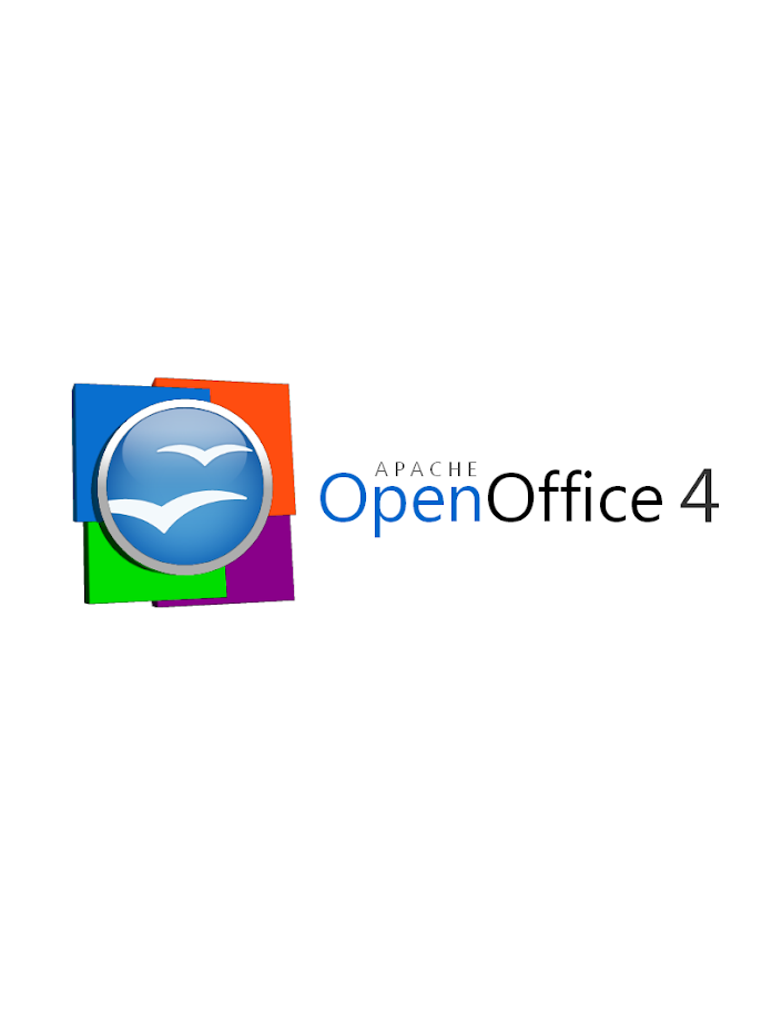
I also like to orb, with the flying documents (aka gulls).

While I understand that many products use a similar palette and the square
document elements to reinforce the office tools, I find the use of both square
and round elements together can feel busy.

Let's keep pushing the design.

Also, with regards to the font, is this an open source font. They was talk of
moving to an open source font. I've experimented with some, but have no clear
front runner yet.

Say, would you be open to posting these on the AOO UX wiki.

Regards,
Kevin

On Dec 20, 2012, at 5:56 PM, Armin Le Grand <[email protected]> wrote:

>    Hi Michael,
>
> I like to continue to use the orb (I think the orb with gulls is simple and
> optimal, the biggest logos in the world are round and simple ;.))
>
> One point I especially like on the existing orb is that the gull is sticking
> out of the orb, somewhat 'freeing' itself. Ths represents 'Open'Office for me
> graphically. Thus, I do not like the orb to be surrounded by a metal looking
> ring (better just use the orb's blue with e.g. rounded edges and let the
> light play and do the rest). The ring cuts off the gull and somewhat
> 'emprisones' it from my POV.
>
> We also have more than 4 apps (at lest we sould not limit us to that in the
> logo, maybe new modules show up one day), so I see it critical to try to
> represent the single apps in the logo. It is already difficult enough to
> represent a single app (in the app's default logo) in a way that is intuitive
> enough to make the user identify which app this document is for with a single
> look at it.
>
> Just my 2ct...
>
> Sincerely,
>    Armin
>
> On 20.12.2012 02:33, Michael Acevedo wrote:
>> Greetings to the AOO Team!
>>
>> Hello, after a few months of inactivity I've decided to get back in touch
>> with the AOO community. First, congratulations to the AOO team on
>> a successful graduation into a top-level Apache project from the Apache
>> Incubator.
>>
>> Now the reason on why I am writing this email is to formally submit a logo
>> proposal for the next version of the Apache OpenOffice 4.X logo.
>> Previously, I submitted an initial logo on the Apache OpenOffice Google+
>> community but I went back to the drawing board and created a second version
>> of the logo that both pays respect to the previous Apache OpenOffice orb,
>> but modernizes the look of the overall logo by adding 4 colored squares
>> that represent the four corners of our office suite (Writer, Calc, Impress,
>> and Base) and utilizing a streamlined font.
>>
>> Without further introductions, below I present my official submission for
>> the Apache OpenOffice 4.X logo.
>>
>> This first logo, is the proposed official logo for the project that would
>> be used for our webpage and some other materials.
>>
>> https://lh3.googleusercontent.com/-lETVSrwcgJc/UNJpH6G1sxI/AAAAAAAAABg/JnpNrXdRgUo/s653/AOO%25204%2520LOGO%2520v2-5%2520Small%2520copy.jpg
>>
>> There's a secondary logo, which is basically the same logo but changes the
>> proportion of the OpenOffice orb making it better suited for the splash
>> screen that appears at the launch of the application.
>>
>> https://lh4.googleusercontent.com/-uy8gU24uBZw/UNJpH8UiKiI/AAAAAAAAABk/xfXTQjO8iQg/s912/AOO%25204%2520LOGO%2520v2-2.png
>>
>> Hope you guys like it and Happy holidays!
>>
>