Hi Michael,
this
(https://svn.apache.org/repos/asf/openoffice/ooo-site/trunk/content/images/AOO_logos/)
might help, these are the checked-in logos. You can access it with a
browser. Look at the SVG directory there; I am not sure if the complete
gulls will be extractable; I fear they are 'cut', but maybe repaired by
using the other wing.
Looking forward to your suggestions :)

Sincerely,
    Armin

On 21.12.2012 17:48, Michael Acevedo wrote:
Hello Armin,

I was tempted to make a rounded corner marquee for the current logo but
desisted of the idea after the vereditct of the Apple v. Samsung case where
they were able to sue Samsung on using rounded corners for apps on their
flavor of android. Still I find the rounded corners tempting and is
actually reflected on the second logo that appeared on the last jpeg file I
sent yesterday.

All of these are good suggestions and I am now thinking of something on
updating the orb, maybe keeping the basic shape of the logo which is a
circle. I am rambbling here but I might be able to come up with something
tangible during the next few hours.

Now the only thing I would need to find is an EPS or PSD
high-res version of the AOO gulls. Where can I find that?

Thanks for the suggestions.


On Friday, December 21, 2012, Armin Le Grand wrote:
     Hi Michael,

thanks for investigating here. While I like the original orb and the
colored rects seem to lead to windows trademark stuff, what about:

- only slightly changing the AOO logo
- replacing the orb with a shape also very popular today
- keeping the color, keeping the seagulls
...but as shape, take the now famous 'app' form - a rounded rectangle
instead of the orb, using exactly the dimensions of app logos, and the
color blending of app logos (they use some 'bow' on the middle, making the
upper half slightly lighter than the lower one).
Just as on iOS devices. Maybe looking nice ;-) Will look modern :-)

HTH!
Sincerely,
     Armin

On 20.12.2012 02:33, Michael Acevedo wrote:
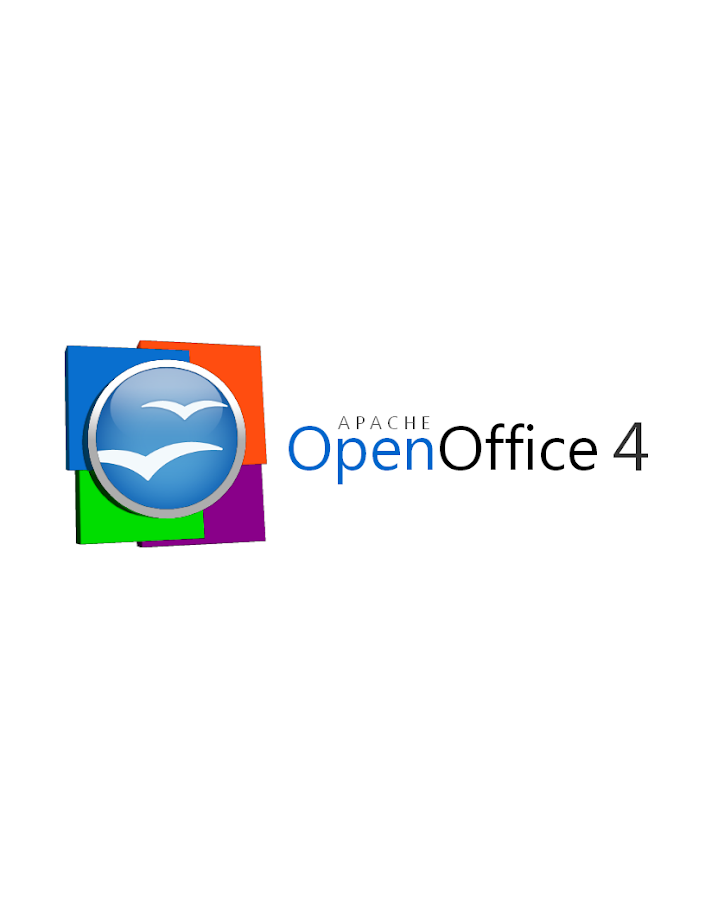
Greetings to the AOO Team!

Hello, after a few months of inactivity I've decided to get back in touch
with the AOO community. First, congratulations to the AOO team on
a successful graduation into a top-level Apache project from the Apache
Incubator.

Now the reason on why I am writing this email is to formally submit a logo
proposal for the next version of the Apache OpenOffice 4.X logo.
Previously, I submitted an initial logo on the Apache OpenOffice Google+
community but I went back to the drawing board and created a second
version
of the logo that both pays respect to the previous Apache OpenOffice orb,
but modernizes the look of the overall logo by adding 4 colored squares
that represent the four corners of our office suite (Writer, Calc,
Impress,
and Base) and utilizing a streamlined font.

Without further introductions, below I present my official submission for
the Apache OpenOffice 4.X logo.

This first logo, is the proposed official logo for the project that would
be used for our webpage and some other materials.

https://lh3.googleusercontent.**com/-lETVSrwcgJc/UNJpH6G1sxI/**
AAAAAAAAABg/JnpNrXdRgUo/s653/**AOO%25204%2520LOGO%2520v2-5%**
2520Small%2520copy.jpg<https://lh3.googleusercontent.com/-lETVSrwcgJc/UNJpH6G1sxI/AAAAAAAAABg/JnpNrXdRgUo/s653/AOO%25204%2520LOGO%2520v2-5%2520Small%2520copy.jpg>

There's a secondary logo, which is basically the same logo but changes the
proportion of the OpenOffice orb making it better suited for the splash
screen that appears at the launch of the application.

https://lh4.googleusercontent.**com/-uy8gU24uBZw/UNJpH8UiKiI/**
AAAAAAAAABk/xfXTQjO8iQg/s912/**AOO%25204%2520LOGO%2520v2-2.**png<https://lh4.googleusercontent.com/-uy8gU24uBZw/UNJpH8UiKiI/AAAAAAAAABk/xfXTQjO8iQg/s912/AOO%25204%2520LOGO%2520v2-2.png>

Hope you guys like it and Happy holidays!