imacat,
  Your comments are so professional! :-)
  Personally I like this logo design more comparing to other candidates in
wiki<https://cwiki.apache.org/confluence/display/OOOUSERS/AOO+4.x+-+Logo+Explorations>.
Thanks Michael!
  While we may also want to update the app icon design as the next step for
consistent L&F...
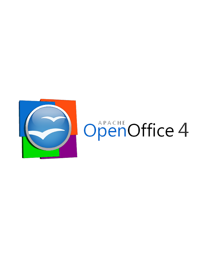
- Shenfeng (Simon)


2012/12/20 imacat <[email protected]>

>     Some honest thoughts:
>
>      1. These flat 3D plates feel a little weird.  The lights of the
> plates has the focus effect, but the lights of the plates have not.
>
>      2. I cannot see the connection of these plates with our four
> components easily, as the colors of Writer, Calc, Impress and Base are
> not Blue, Orange, Green and Purple.  And we have other components such
> as Math and Draw.
>
>      3. The directions of the lights are contradictory.  The lights of
> the orb come from above, while the lights of the plates (and also the
> plate of the orb) come from right.
>
>     But still, thanks you very much for this great effort.
>
> On 2012/12/20 09:33, Michael Acevedo said:
> > Greetings to the AOO Team!
> >
> > Hello, after a few months of inactivity I've decided to get back in touch
> > with the AOO community. First, congratulations to the AOO team on
> > a successful graduation into a top-level Apache project from the Apache
> > Incubator.
> >
> > Now the reason on why I am writing this email is to formally submit a
> logo
> > proposal for the next version of the Apache OpenOffice 4.X logo.
> > Previously, I submitted an initial logo on the Apache OpenOffice Google+
> > community but I went back to the drawing board and created a second
> version
> > of the logo that both pays respect to the previous Apache OpenOffice orb,
> > but modernizes the look of the overall logo by adding 4 colored squares
> > that represent the four corners of our office suite (Writer, Calc,
> Impress,
> > and Base) and utilizing a streamlined font.
> >
> > Without further introductions, below I present my official submission for
> > the Apache OpenOffice 4.X logo.
> >
> > This first logo, is the proposed official logo for the project that would
> > be used for our webpage and some other materials.
> >
> >
> https://lh3.googleusercontent.com/-lETVSrwcgJc/UNJpH6G1sxI/AAAAAAAAABg/JnpNrXdRgUo/s653/AOO%25204%2520LOGO%2520v2-5%2520Small%2520copy.jpg
> >
> > There's a secondary logo, which is basically the same logo but changes
> the
> > proportion of the OpenOffice orb making it better suited for the splash
> > screen that appears at the launch of the application.
> >
> >
> https://lh4.googleusercontent.com/-uy8gU24uBZw/UNJpH8UiKiI/AAAAAAAAABk/xfXTQjO8iQg/s912/AOO%25204%2520LOGO%2520v2-2.png
> >
> > Hope you guys like it and Happy holidays!
> >
>
>
> --
> Best regards,
> imacat ^_*' <[email protected]>
> PGP Key http://www.imacat.idv.tw/me/pgpkey.asc
>
> <<Woman's Voice>> News: http://www.wov.idv.tw/
> Tavern IMACAT's http://www.imacat.idv.tw/
> Woman in FOSS in Taiwan http://wofoss.blogspot.com/
> OpenOffice http://www.openoffice.org/
> EducOO/OOo4Kids Taiwan http://www.educoo.tw/
> Greenfoot Taiwan http://greenfoot.westart.tw/
>
>