I really like the pinwheel...and combine it with the suggestion of
replacing the flat color with small text, would just make it perfect.
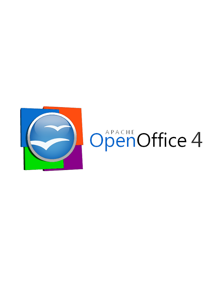
I also think it is ok, that blue is in 3d and the pins flats, that seems
quite natural to me.

Jan.


On 20 December 2012 19:51, imacat <[email protected]> wrote:

> On 2012/12/20 13:06, Michael Acevedo said:
> >      Here's my personal insight on the logo decisions when it comes to
> the
> > amount of squares and coloring scheme. The first is that I tried for
> hours
> > how to integrate six squares into the logo and the problem that arose was
> > that the logo looked too crowded. As a result I had to strike a
> compromise,
> > pick the four applications or modules that embody an office suite in
> > general which are the word processor, spreadsheet, presentation module,
> and
> > database creator. OpenOffice is the only office suite that comes to
> memory
> > that does have a formula editor and a radically unique graphics drawing
> > program (closest analogue is Microsoft Publisher but Draw is a different
> > animal).
>
>     I see.  But there are other ways of representing the OpenOffice
> components instead of the square boxes.  I tried to make some as
> attached, although they are not finished works.  Please forgive me that
> I'm not a designer.  We can have a more lively design than square boxes.
>
>     We can give up this idea of showing the components if that is too
> difficult.  But for some people, draw is more important than base.  It
> is simply not right to show only four components.
>
> >      Moving now to the color scheme, the colors for the squares that
> > represent the office suite core components were inspired upon the AOO
> start
> > center which has icons for the word, spreadsheet, presentation, and
> > database modules. If you look closely, each of the icons there have a
> color
> > code, the Writer document icon has blue accents, Calc document icon has
> > green accents, Impress icon has orange accents, and the Base icon has
> > violet accents. Therefore, it was a logical decision to color the squares
> > accordingly.
>
>     I know, but these colors do not match the colors of the components.
>  That's why I said for the missing connection between the components and
> the colors.  Writer is silver-blue, not blue.  Base is dark red, not
> purple.  Seeing the colors on the four plates cannot remind people about
> our four components.
>
> >      When it comes to the lighting of the logo... I beg to differ. I'll
> > need to sleep over that to see whether or not it is worth considering
> > tweaking the lighting. In my honest opinion, I think the current lighting
> > works fine for the logo.
>
>     Please sleep well and take care of yourself.
>
>     We do not have to stick on the lights of the orb.  My original point
> was about the contrary between the lights and the view angle of the orb
> and the plates.  I did not mean the plates need to follow the orb.  I
> just meant that the logo needs a consistent look and feel, consistent
> lights and view angles.  Or it is simply just not right.
>
>     If the orb is 3-D with the focused light, all other parts has to be
> 3-D with focused light.  If the plate is flat, all other parts has to be
> flat.
>
>     Actually, we may give up or tweak the orb when necessary.  If we
> have to retain the old design for every logo revision, the only thing we
> can do is adding.  Then, we will have a very complicated logo in less
> than 3 years.  That is not right for the design work.
>
>     I personally like the 3-D and focused light effect.  If it is too
> hard to apply the 3-D and focused light effect on other parts of the
> logo, we can simply remove the existing lights and apply new light and
> view angle on everything.  The only point is consistent.
>
> >
> > Thanks for the feedback.
> >
> >
> >
> > On Wed, Dec 19, 2012 at 11:31 PM, imacat <[email protected]>
> wrote:
> >
> >>     Some honest thoughts:
> >>
> >>      1. These flat 3D plates feel a little weird.  The lights of the
> >> plates has the focus effect, but the lights of the plates have not.
> >>
> >>      2. I cannot see the connection of these plates with our four
> >> components easily, as the colors of Writer, Calc, Impress and Base are
> >> not Blue, Orange, Green and Purple.  And we have other components such
> >> as Math and Draw.
> >>
> >>      3. The directions of the lights are contradictory.  The lights of
> >> the orb come from above, while the lights of the plates (and also the
> >> plate of the orb) come from right.
> >>
> >>     But still, thanks you very much for this great effort.
> >>
> >> On 2012/12/20 09:33, Michael Acevedo said:
> >>> Greetings to the AOO Team!
> >>>
> >>> Hello, after a few months of inactivity I've decided to get back in
> touch
> >>> with the AOO community. First, congratulations to the AOO team on
> >>> a successful graduation into a top-level Apache project from the Apache
> >>> Incubator.
> >>>
> >>> Now the reason on why I am writing this email is to formally submit a
> >> logo
> >>> proposal for the next version of the Apache OpenOffice 4.X logo.
> >>> Previously, I submitted an initial logo on the Apache OpenOffice
> Google+
> >>> community but I went back to the drawing board and created a second
> >> version
> >>> of the logo that both pays respect to the previous Apache OpenOffice
> orb,
> >>> but modernizes the look of the overall logo by adding 4 colored squares
> >>> that represent the four corners of our office suite (Writer, Calc,
> >> Impress,
> >>> and Base) and utilizing a streamlined font.
> >>>
> >>> Without further introductions, below I present my official submission
> for
> >>> the Apache OpenOffice 4.X logo.
> >>>
> >>> This first logo, is the proposed official logo for the project that
> would
> >>> be used for our webpage and some other materials.
> >>>
> >>>
> >>
> https://lh3.googleusercontent.com/-lETVSrwcgJc/UNJpH6G1sxI/AAAAAAAAABg/JnpNrXdRgUo/s653/AOO%25204%2520LOGO%2520v2-5%2520Small%2520copy.jpg
> >>>
> >>> There's a secondary logo, which is basically the same logo but changes
> >> the
> >>> proportion of the OpenOffice orb making it better suited for the splash
> >>> screen that appears at the launch of the application.
> >>>
> >>>
> >>
> https://lh4.googleusercontent.com/-uy8gU24uBZw/UNJpH8UiKiI/AAAAAAAAABk/xfXTQjO8iQg/s912/AOO%25204%2520LOGO%2520v2-2.png
> >>>
> >>> Hope you guys like it and Happy holidays!
> >>>
> >>
> >>
> >> --
> >> Best regards,
> >> imacat ^_*' <[email protected]>
> >> PGP Key http://www.imacat.idv.tw/me/pgpkey.asc
> >>
> >> <<Woman's Voice>> News: http://www.wov.idv.tw/
> >> Tavern IMACAT's http://www.imacat.idv.tw/
> >> Woman in FOSS in Taiwan http://wofoss.blogspot.com/
> >> OpenOffice http://www.openoffice.org/
> >> EducOO/OOo4Kids <http://www.openoffice.org/EducOO/OOo4Kids> Taiwan
> >> http://www.educoo.tw/
> >> Greenfoot Taiwan http://greenfoot.westart.tw/
> >>
> >>
> >
> >
>
>
> --
> Best regards,
> imacat ^_*' <[email protected]>
> PGP Key http://www.imacat.idv.tw/me/pgpkey.asc
>
> <<Woman's Voice>> News: http://www.wov.idv.tw/
> Tavern IMACAT's http://www.imacat.idv.tw/
> Woman in FOSS in Taiwan http://wofoss.blogspot.com/
> OpenOffice http://www.openoffice.org/
> EducOO/OOo4Kids Taiwan http://www.educoo.tw/
> Greenfoot Taiwan http://greenfoot.westart.tw/
>