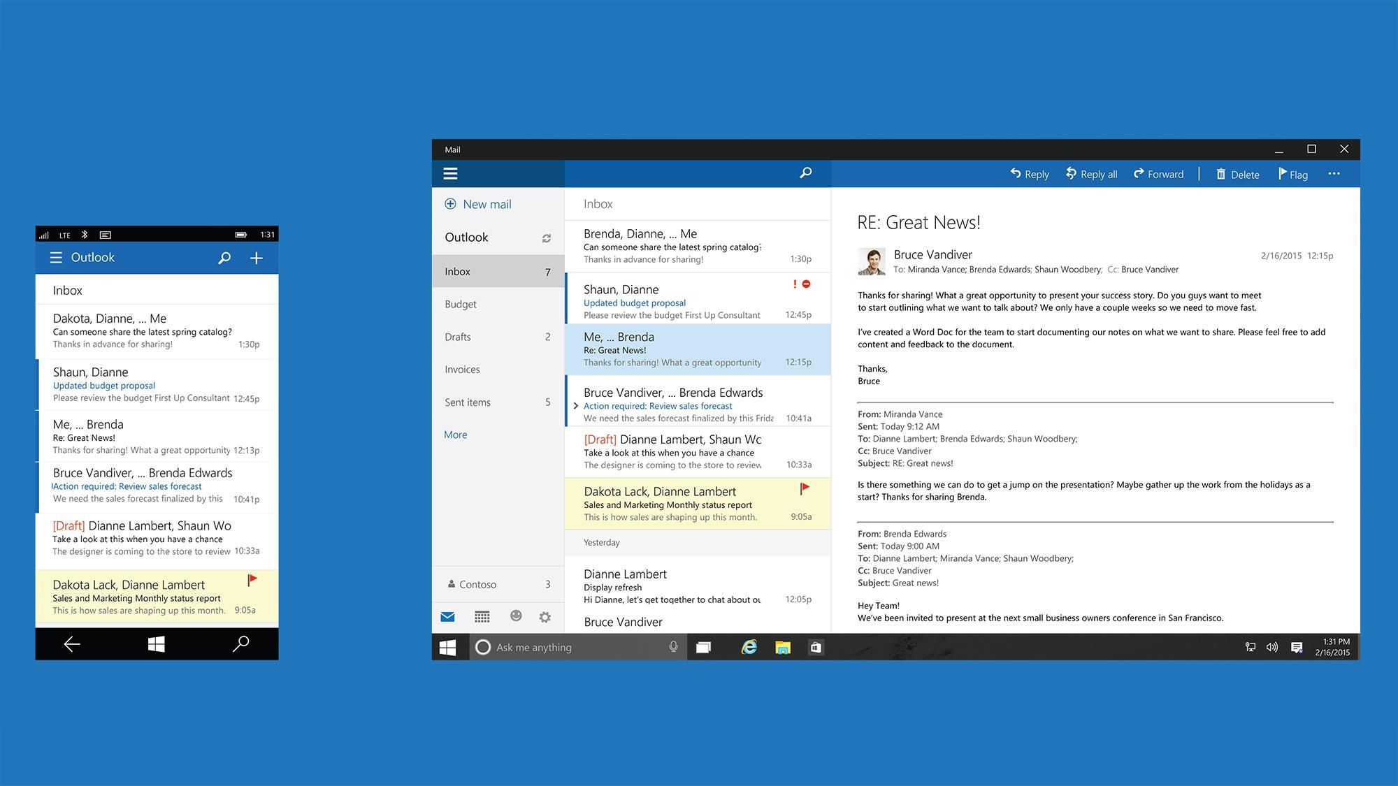
-----BEGIN PGP SIGNED MESSAGE-----
Hash: SHA1

Michael Zanetti wrote on 14/01/16 11:07:
>
> On 12.01.2016 18:36, Matthew Paul Thomas wrote: ...
>> You can't just make some on-screen elements bigger for
>> touchability and assume that there will be no tradeoff. Other
>> elements will get smaller, and that has a cost. If someone has no
>> touchscreen, or has one but doesn't want to use it, it's a cost
>> with no benefit.
>
> I do see the tradeoffs your're mentioning. However, I don't think
> that is really so much of a problem, especially for the example of
> a mail client. Take for instance that picture:
> http://www.windowsmode.com/wp-content/uploads/2015/08/Windows-10-Outlook.jpg
>
>
That layout owes much more to wide screens, and HTML and RFC3676
mail, than it does to touch screens. With a wide screen, and messages
that can (and, for readability, sometimes should) be rewrapped, you get
more information density overall from using some of that screen width
for a taller message list instead. That, in turn, means each row in
the list can and should present its information on multiple lines.
(Thunderbird development apparently stalled too soon, after
wide-screen displays became popular, for it to get an equivalent
message list -- making its "Vertical View" near-useless.)
Outlook 2003, 2007, and 2010 all, by default, switched automatically
between a two-column layout ▯⬒ and a three-column layout ◨□ depending
on how wide your mail window happened to be -- in an era when hardly
any of the machines Outlook ran on had touch screens. And OS X Mail
switched from a two-column layout to a three-column layout by default
in 2011 -- despite the fact that Macs have never had touch screens.
This demonstrates that information density is the deciding factor.
That the three-column layout happens to be easily touchable is a
coincidence.

So, perhaps I should have chosen a less complex example. But the point
remains that information density is important, and all else being
equal, making an app easy to touch lowers that density. It isn't
always reasonable to rearrange a list item to multiple lines like it
is in an e-mail message list.

> I wouldn't say the fact that it is touch enabled is killing it's
> usefulness to be operated with a mouse.  IMO if it would be
> switching between small vs big ui elements all the time, it would
> be much more confusing.
>
> ...

Nobody said "killing". And Daniel d'Andrada has given the example of
Gmail, which has a "Comfortable"/"Cozy"/"Compact" view.

This suggests that some of this adaptation could be done by the
toolkit automatically. List item padding could be one of the things
that changes the first time you use a mouse, and changes back when you
resume using your fingers.

- --
mpt

-----BEGIN PGP SIGNATURE-----
Version: GnuPG v2.0.22 (GNU/Linux)

iEYEARECAAYFAlac+CUACgkQ6PUxNfU6ecpC1QCeLa9KtbS8TKEO4X8vUuzw7WLC
Z4wAn1aimw6gICBe7wpguR+Pq9vQsC/0
=75di
-----END PGP SIGNATURE-----

--
Mailing list: https://launchpad.net/~ubuntu-phone
Post to     : ubuntu-phone@lists.launchpad.net
Unsubscribe : https://launchpad.net/~ubuntu-phone
More help   : https://help.launchpad.net/ListHelp