OK this is bound to be something silly as I'm completely new to R -
having started using it yesterday.  However I am already warming to its
lack of 'proper' GUI... I like being able to rerun a command by editing
one parameter easily... try and do that in a Excel Chart Wizzard!
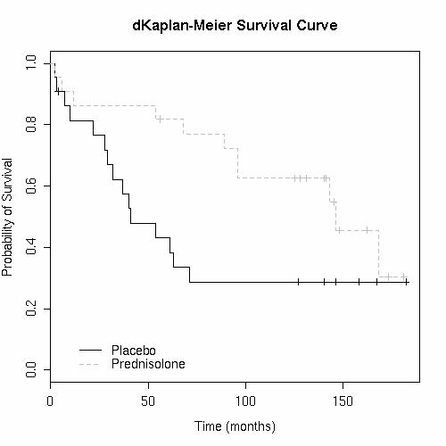
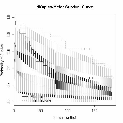
I eventually want to use it to analyse some chemotherapy response /
survival data. That data will not be mature and so my interest is in
using it to deliver predictions of what mature data may produce by using
Weibull Regression

However for now I've borrowed a dataset from the BMJ (CSV tabs seperated
version here:
http://www.wittongilbert.free-online.co.uk/HepatitisData.csv ) and am
trying to plot some curves.

I've succeeded in plotting a Kaplan-Meier Survival Curve by using the
following:

 > my_var.bygroup <- survfit(Surv (Survival, Censored==0) ~
TreatmentGroup, data=TestData)
 > plot(my_var.bygroup, conf.int=FALSE, col=c("black","grey"), lty=1:2,
legend.text=c("Placebo","Prednisolone"), main="dKaplan-Meier Survival
Curve",  xlab="Time (months)", ylab="Probability of Survival")

That produces this: http://www.wittongilbert.free-online.co.uk/RGraph.jpg

All of that  is very nice so far.  The  I followed bits and pieces of
other peoples posts in the past to plot on a weibull regression...

 > my_curve.Plac <- survreg( Surv(Survival, Censored==0)~
TreatmentGroup, subset=TreatmentGroup=="Placebo", data=TestData,
dist='weibull')
 > curve(pweibull(x, scale=exp(coef(my_curve.Plac)),
shape=1/my_curve.Plac$scale, lower.tail=FALSE),from=0, col="black",
to=max(TestData$Survival), add=TRUE)
 > my_curve.Pred <- survreg( Surv(Survival, Censored==0)~
TreatmentGroup, subset=TreatmentGroup=="Prednisolone", data=TestData,
dist='weibull')
 > curve(pweibull(x, scale=exp(coef(my_curve.Pred)),
shape=1/my_curve.Pred$scale, lower.tail=FALSE),from=0, col="grey",
to=max(TestData$Survival), add=TRUE)

This is where I have my problem - and I know its going to be something
really silly!  Look at my output:
http://www.wittongilbert.free-online.co.uk/RGraph2.jpg the trend line is
zig-zagging between y=0 and the value it should be.  If you draw a line
along the tips of the zig-zags I guess thats a reasonable trendline...

Anyone able to help me on this?

Also is it possible to get an R-squared type value for the fit of this
curve from someplace?

Finally (three questions in one!) the first two censored data points (1
in each group) are actually lost to follow-ups.  Should they be marked
differently from censored?

Sorry I know thats a mamoth post - and have a horrible feeling someone's
going to say 'You are trying to do something thats statistically wrong!'
- feel free!

Many thanks

______________________________________________
R-help@r-project.org mailing list
https://stat.ethz.ch/mailman/listinfo/r-help
PLEASE do read the posting guide http://www.R-project.org/posting-guide.html
and provide commented, minimal, self-contained, reproducible code.