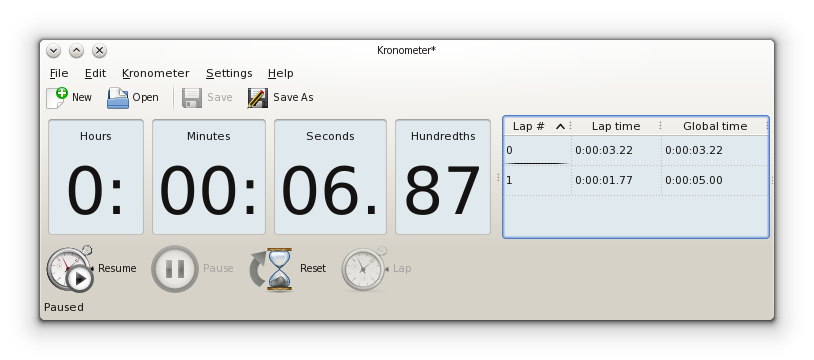
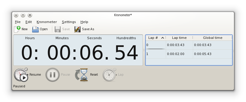
On Wednesday 16 April 2014 12:56:01 Elvis Angelaccio wrote:
> So, the choice is between the branch <test> and <test2>. Let me know
> what do you prefer.
>
> For completeness the alternatives in details are:
>
> - branch <test>: no splitters, with dividers (i.e. 4 QFrames in a
> horizontal layout):
> http://abload.de/img/kronometer-no-splittevdklc.png
This would look much better if you remove the ':' and '.' after the
numbers. IMO the ':'/'.' are superfluous because the numbers are already
clearly separated by the frame border.

Also you should probably right-align the numbers. In particular, the
hours. For the other numbers alignment probably doesn't matter.
Moreover, I think it would look best if all four frames were the same
size.


> - branch <test2>:
> no splitters, no dividers (i.e. single QFrame with a grid layout):
> http://abload.de/img/kronometer-no-divideri4kce.png

Here the ':'/'.' need to stay for obvious reasons. But you should try to
make the spacing between the numbers and the ':'/'.' identical. Possible
solution: Put the ':'/'.' into columns of their own. And right-align the
hours.


I'd also get rid of the upper toolbar. You do already have the essential
tools in the lower toolbar and having two toolbars even with differently
sized icons makes the UI look unnecessarily crowded.


Just my two cents.


Regards,
Ingo
![]() signature.asc
signature.asc
Description: This is a digitally signed message part.