>> (For the record: yes, I know why org-mode has trouble with i18n export
>> to LaTeX.  Yes, it's a hard problem.  Yes, fixing it might not be worth
>> the effort.  All of this is true.  None of it changes how annoyed I am
>> by the bug, though.)
>
> Do you happen to have links to the relevant bug reports, or other
> documentation of the issues?
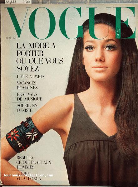
I don't; for all I know nobody's reported it yet.  (If that's the case,
I should.)  The problem stems from how orgmode assumes that downstream
tools can parse UTF-8.  LaTeX way predates UTF-8 and requires that
foreign symbols be composed using TeX escape sequences.  For orgmode to
translate UTF-8 to LaTeX reliably would require it to keep track of an
impractically large translation table: Greek characters, French,
Cyrillic, grave and acute accents, circumflex composition, and more.

LaTeX is unique among document processing systems in that it can
effortlessly represent the correct orthography for the rock group Spinal
Tap (which uses a Turkish dotless lowercase i and a Jacaltec umlauted
n), but that comes with a steep price: namely, its near complete
inability to handle Unicode like the rest of the world.

> Also, have you explored alternative pipelines from Org-mode to PDF?
> Maybe via ODT or Markdown, etc?

I tried pandoc, but without good effect.  I haven't explored it further.

> Hm, you think it produces high-quality print output, but you don't like
> the way it looks on the page. Not a *direct* contradiction, maybe... ;)

Sure!  I also think Marisa Berenson is the most fashionable woman in the
world... for 1967.  Look at photographs of Marisa Berenson from the '60s
and you'll be stunned at the fashion ensembles she wore: beautiful,
striking, and memorable.  But if you were to see someone walking down
the street dressed like that, you'd think they came to the party about
forty years late.  :)

Typography is the fashion of literature.  If you want to look good, you
need to balance the timeless with the temporal.  Texinfo looks really
good for the 1970s, but by current standards it's pretty antiquated.

Typography and layout are, believe it or not, user interface issues.  If
the user's response on seeing the printed documentation is "did this
just fall out of the '70s?", they're probably going to start off with a
negative impression of the work.  To make documentation approachable and
something that people actually want to read, you need to make it look
like something current.

... Incidentally, Marisa Berenson on the cover of _Vogue_ in the '60s.
Safe for work.

http://iv1.lisimg.com/image/3906868/442full-marisa-berenson.jpg

> I take your point here, but I'd suggest it isn't a priority. People come
> to GnuPG for the cryptography, not the typography.

The old saw is "you can't judge a book by its cover".  The old saw is
wrong.  Book publishers spend enormous amounts crafting their books so
that you have a positive experience with it from the moment your eye
lands on the cover in the bookstore.

Typography and layout matter.


_______________________________________________
Gnupg-users mailing list
Gnupg-users@gnupg.org
http://lists.gnupg.org/mailman/listinfo/gnupg-users