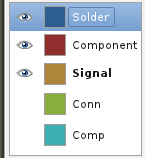
Andrew Poelstra wrote:

> I think such a thing would look like:
> http://wpsoftware.net/andrew/dump/selector.png
>
> What do people think of this?
Invisibility by greyed out buttons is much more easily grasped
on a glance than presence or abcense of an eye icon. I'd prefer to
not have eye icons and signal visibility by greying out.

Fat print of the current layer is a nice way to signal the current
layer. Maybe the background of the layer name can be highlighted in
some way, too. The current layer is one of the most important bits
of information the layer block delivers.

Buttons should be all the same size, rather than just the
size of the respective layer name.

If you go for such a radical change, please make it so, that
the larger button selects the current layer. Select of a layer
is much more common than change of visibility.

---<)kaimartin(>---
--
Kai-Martin Knaak
Email: k...@familieknaak.de
http://pool.sks-keyservers.net:11371/pks/lookup?search=0x6C0B9F53
not happy with moderation of geda-user


_______________________________________________
geda-user mailing list
geda-user@moria.seul.org
http://www.seul.org/cgi-bin/mailman/listinfo/geda-user