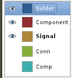
On Thu, Aug 18, 2011 at 07:31:24AM +1000, Stephen Ecob wrote:
> > Good point.  I do like the full color fill you show, Andrew.  However,
> > I think we need a better way of indicating which layers are visible.
> > Perhaps a little "X" or checkbox icon on the button?  I already dislike
> > the current buttons' indication of which layers are visible (change of
> > fill color and text color with inset or outset border). Maybe something
> > better can be done.
>
> Photoshop (and also GIMP) use a small on/off icon that looks like an
> eye to control layer visibility. This may or may not be a good way to
> do it, but it is certainly a familiar UI to many people.
>
I think such a thing would look like:
http://wpsoftware.net/andrew/dump/selector.png

What do people think of this?

--
Andrew Poelstra
Email: asp11 at sfu.ca OR apoelstra at wpsoftware.net
Web:   http://www.wpsoftware.net/andrew/


_______________________________________________
geda-user mailing list
geda-user@moria.seul.org
http://www.seul.org/cgi-bin/mailman/listinfo/geda-user