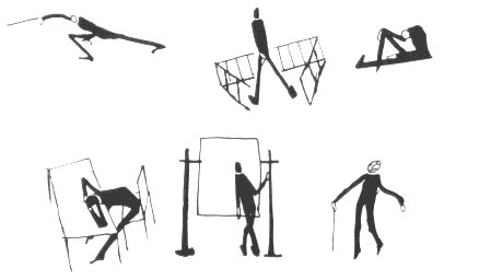
Here are are a few of my thoughts on a Kafka logo:

1. This is an open source project not an accounting firm, so it can be kind
of cool looking (doesn't have to be too bland/corporate).
2. But I don't think our logo should be a cockroach because they are icky.
3. Characters is Kafka books are often called "K." or "Joesph K" or
something like that so a stylized K would be an option.
4. Kafka had a number of stylized sketches of figures that are actually
pretty cool:
http://3.bp.blogspot.com/-XEU25Q9oRlo/TzcM5VVa9YI/AAAAAAAAAF8/f3O4LLPkHNs/s1600/drawings.jpg
5. I particularly like the black and white sketchy styling of those
drawings. I think black and white would be a nice color scheme.
6. There is also an Andy Warhol Kafka sketch which might be good for
inspiration:
http://www.electronicbeats.net/wp-content/uploads/2012/08/kafka_small-940x391.jpg
7. Our domain is streams which could be visually kind of twisted and whispy.
-Jay


On Wed, Dec 19, 2012 at 10:03 AM, Jay Kreps <jay.kr...@gmail.com> wrote:

> A few people have asked about getting a logo for Kafka. I think this would
> be a great idea!
>
> Oliver has kindly offered to have a someone at Datadog take a shot at it.
> If that doesn't pan out I am happy to do a 99designs contest to get us more
> options.
>
> It would be good for people to use this thread to give ideas or thoughts
> on what might be good. I will follow up with mine. I will give this a day
> or so and then try to summarize the suggestions/guidance so that any
> potential designer isn't overwhelmed by contradictory suggestions.
>
> -Jay
>