Paul,

That could work. But if we're recalculating every time the window's
content changes that would likely (1) cost many cycles and (2) be very
distracting.
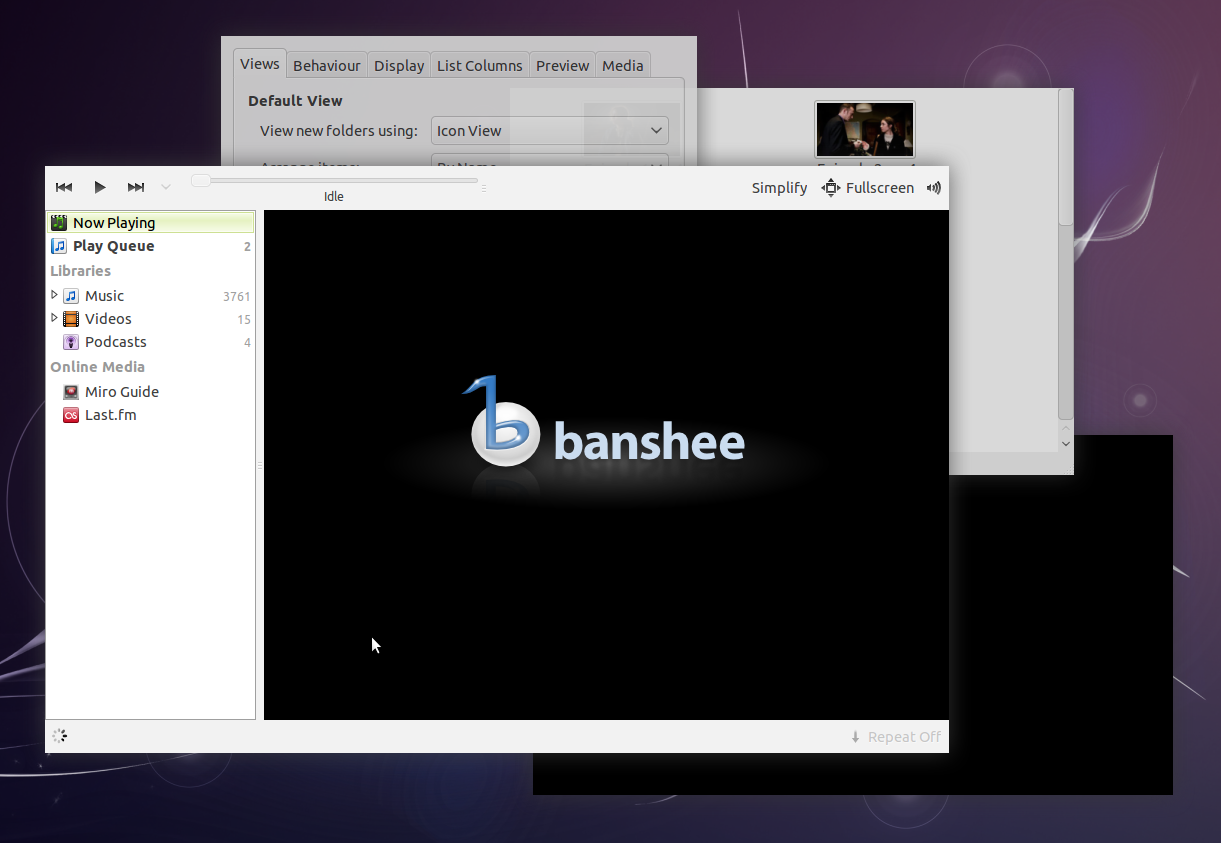
Hopefully these screenshots demonstrate that a simple mid-grey shadow
works well: it provides good visual contrast if the window and
background don't already contrast; but it looks subtle if there's
already plenty of contrast.

In particular, look at the bottom-right of the Banshee window on this
new screenshot—the shadow's only visible at the black-on-black edge.

Notably, it still looks like a shadow in the usual case of a light
background. The only case where this fails to ensure contrast is a mid-
grey window on a mid-grey background. None of our default UI is mid-
grey.

** Attachment added: "These shadows are #404040ff at 0.75 opacity; radius 24px,
offsets 0."

https://bugs.launchpad.net/ubuntu/+source/light-themes/+bug/733233/+attachment/1913592/+files/Grey%20shadows%202.png

--
You received this bug notification because you are a member of Ubuntu
Bugs, which is subscribed to Ubuntu.
https://bugs.launchpad.net/bugs/733233

Title:
  Increase shadow area to 45 pixels (but not grip area)

--
ubuntu-bugs mailing list
ubuntu-bugs@lists.ubuntu.com
https://lists.ubuntu.com/mailman/listinfo/ubuntu-bugs