On 5/13/06, Frank Schoep <[EMAIL PROTECTED]> wrote:
Hello everyone,
I felt it was time to put my money where my mouth is, so here you go:
http://www.ffnn.nl/media/external/ubuntu/usplash/usplash-minimalistic_0.1.deb
What it has:
- 100% correct Ubuntu colors
- Sharp antialiased logo
- No text, only "FAIL" if something goes wrong
- Graceful fallback if fullscreen is not possible (rounded corners)
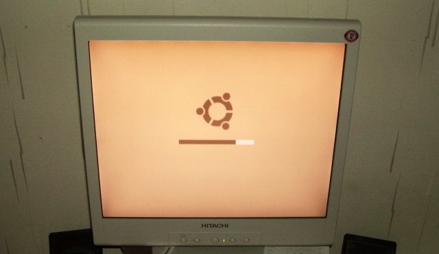
It looks like this on a proper screen:
http://www.ffnn.nl/media/external/ubuntu/usplash/minimalistic-working-full.jpg
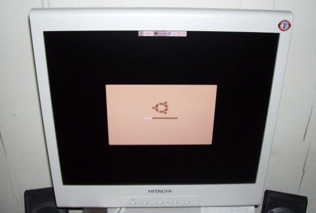
It looks like this on a non-scaling screen (notice the round corners):
http://www.ffnn.nl/media/external/ubuntu/usplash/minimalistic-working-squashed.jpg
Please test and let me know if it works, what you think and what can be
improved [1] [2].
I'm still a huge supporter of dropping the boot text: no other significant
commercial OS I know of shows techno talk on boot, I think it's time to get
Ubuntu into the 21st century like the others.
I hope I've also disproved a lot of talk about how this can't be done properly
and that I'm unaware of usplash limitations, I've kept them in mind even
before starting my first sketches.
I think I've solved the non-scaling screen issue quite elegantly by adding
rounded corners to the splash, maybe they could be a bit rounder, but I think
they're fine as is. At the moment, you don't really notice them in fullscreen
mode, which is good.
I would really _love_ to get some reports streaming in about this splash
looking bad on someone's hardware so that I can get a reality check.
Wow, your splash looks absolutely fantastic. I'll give it a spin
now... Did you manage to fix the jaggedness?

--
ubuntu-art mailing list
[email protected]
https://lists.ubuntu.com/mailman/listinfo/ubuntu-art