Hi,

would like to plot the overlayed monthly production of my solar
inverters for the last years. RRD consolidation is done per month, so I
have 12 values per year to overlay.
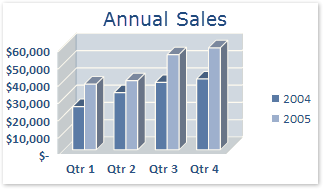
simply plotting LINE or AREA doesn't do the trick, as for some years the
monthly production is higher than the other years and vice versa -> the
lines and/or areas cross, for areas the colors add up and in the end
it's not readable at all. I currently have 4 years of data, can't
imagine to be able to see something if I overlay 10 years !

I think the best way to display such data would be what I found out to
be called clustered graph, i.e. for each month the year's columns side
by side (see
https://support.content.office.net/en-US/media/709339c5-da15-400a-8ca1-21ef1d709fe5.gif
for a demo pic of that kind of graph in excel).

Everybody knows that kind of representation, but now question is how to
draw this with RRDgraph ? I'm not aware of a command to make columns
narrower and group graphs side by side.

Thanks

Joel

_______________________________________________
rrd-users mailing list
[email protected]
https://lists.oetiker.ch/cgi-bin/listinfo/rrd-users