On Donnerstag, 18. Februar 2016 11:28:27 CET Marco Martin wrote:
> On Thursday 18 February 2016 02:03:08 Thomas Pfeiffer wrote:
> > The thing is: When you open the popup, your attention is focused on it,
> > anyway, regardless of its size. It would feel clunky if we opened it with
> > a
> > long animation like we still do far too often in Plasma, but if it opened
> > and closed quickly enough, I'm convinced that the benefit of not having to
> > scroll so much would outweigh the "cost" of it covering more of the screen
> > which you don't have your attention on anyway.
>
> I don't think the cost is much the increased screen usage.
> I think the major cost is having the overwhelm of all the information at
> once fitted in that sidebar.
>
> We can have 2 scenarios:
> a) all the information  at once (ie all plasmoids open in the side panel: it
> would be cluttered beyond imaginable (and no, you can't control too much
> what's inside the single modules so if one goes this way it *will* be an
> information orgy, no mattter how hard you try to impose design on the
> single modules)
>
> b) all possible thing still by itself, tabbed interface or whatever, so
> notifications alone, networkmanager alone etc. in most cases the sidebar
> will be a desolation of emptyness (with possible increased mouse travel
> distance even)
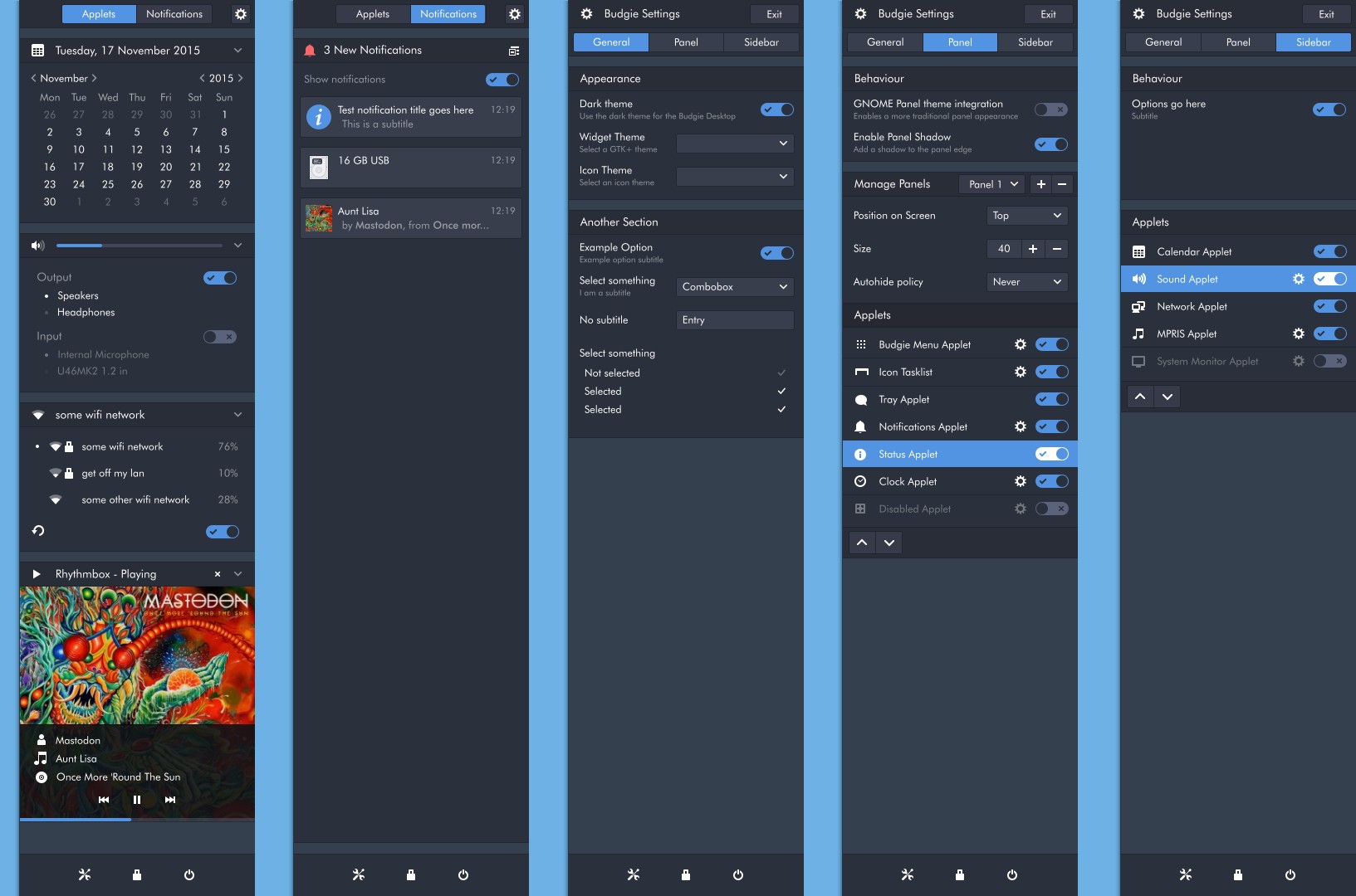
I would really encourage you (and everyone else who is skeptical about our
suggestion) to give deepin or Budgie a quick try (they each have their own
distros, but are available on other distros like Arch as well, and Manjaro has
community spins for both).
(Don't worry, I wouldn't dare asking you to try out Windows 10, though ;) )

They both have a quite powerful sidebar (they both actually do their whole
system configuration in there, which I find a bit extreme, but it seems to be
working out pretty well for them).

Just for a quick glance, feel free to look at this screenshot from the Budgie
sidebar:
http://i1-news.softpedia-static.com/images/news2/solus-linux-os-gets-new-daily-iso-budgie-next-improvements-updated-installer-496874-2.jpg

The first columns shows applets, the second shows notifications. Both of those
look neither "cluttered beyond imaginable" nor like "a desolation of
emptyness" to me.

I can fully understand the fear that it may look too full or too empty, but to
me, Budge and deepin are living proof that a sidebar can be designed in a way
that it doesn't.

Also, our task/Activity switcher sidebar doesn't look desolate to me if there
are only two tasks/Activities to switch between, either.

> Note that since I'm rewriting the systray from scratch, I'm quite affected
> by wether the decision is, I need to take the "proper" architecture, I
> don't want to rewrite it a 3rd time that's for sure!

Yes, you're absolutely right. If there is a time to decide this, it's
definitely now!
_______________________________________________
Plasma-devel mailing list
Plasma-devel@kde.org
https://mail.kde.org/mailman/listinfo/plasma-devel