https://bugs.kde.org/show_bug.cgi?id=499825
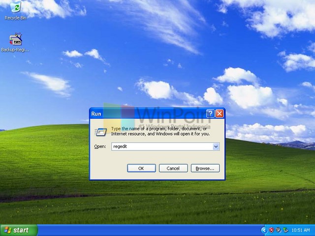
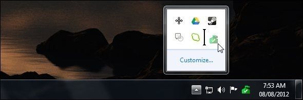
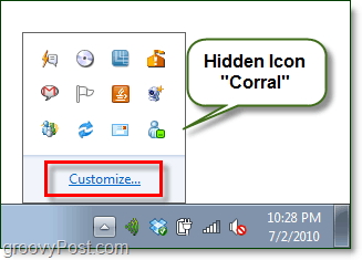
--- Comment #18 from John <ilikef...@waterisgone.com> ---
(In reply to Christian (Fuchs) from comment #11)
> As the author of the original bug report, which did lead to the symbolic
> change:
>
> ...................
> Note that my original request came from having had to use Gnome at work,
> which has a similar feature, to optionally un-hue systray icons to make them
> monochrome. So even Gnome (I think the systray might be a third party app,
> potentially canonical, mind) has an option, so personally I'd still prefer
> the option and would request for the VDG to reconsider.
>
> Given we noticed that people are unhappy with kickoff and offered an option
> there, I think it would be consistent and fair to offer it here, too.
>
> And for the argument of systrays having been monochrome for a while: only
> partially true, some OSes do (or at least try to) a distinction between
> system icons (monochrome) and app icons (colourful)
>
> However, I won't partake in this discussion again, personally.
That's very nice and considerate!
Personally looking a bit back at what I considered the best OSes and designs
that I have ever used with pleasure, I see that Windows XP used a colourful
systray:
https://dl.kaskus.id/winpoin.com/wp-content/uploads/2013/04/icon-system-tray_04.jpeg
While Windows 7 used a monochrome one:
https://static1.makeuseofimages.com/wordpress/wp-content/uploads/2012/08/system-tray-drag-and-drop.jpg
https://www.groovypost.com/wp-content/uploads/2010/07/image_33.png
Unless your device had a Bluetooth adapter too or you have attached a USB
pendrive, which added the Safely remove device icon:
https://learn.microsoft.com/en-us/windows/win32/uxguide/images/winenv-notification-image2.png
If you clicked on the "Customize..." you could set any of them to be
permanently visible on the main systray like I was doing with the "Safely
remove device" as I didn't want to always have to open that drawer.

Having the possibility to have them colorful and then "downgrade" them to
colorless / monochrome would indeed be great and make everyone happy.
It's cool to have the system's incons as monochrome to differentiate them from
others, but that could also by done by other ways, like putting them all to the
right (next to the clock & date) or by using dividers / separators and that
should not forbid people from having colorful system icons, if that's what they
want.

(In reply to Aleksey Kontsevich from comment #14)
> (In reply to Grósz Dániel from comment #8)
>
> > However, some of us dislike symbolic icons, including on the system tray,
> > and have ever since they were introduced a decade ago. There are probably
> > many of us among those who still use Oxygen. Personally, one reason is that
> > I generally dislike minimalistic aesthetics, but the more important one is
> > that they make it harder to find the icon I'm looking for. With colorful
> > icons I can find an icon with a glance, with symbolic icons I have to focus
> > on each one until I find the one I'm looking for.
>
> Exactly! Same perception: colorful much easier and faster to find: for
> example by color, then by shape. With symbolic: need to watch all of them to
> distinguish the necessary one only by its shape.
Same here too!
If find much easier (less effort) and faster to find by color and then by
shape.
Like with the Brightness and Color icon which takes me a while to find, because
it's not next to the Power and Battery where I expect it to be and there are
other things I don't need at that moment between them, for which I created
this:
https://bugs.kde.org/show_bug.cgi?id=498827
And because the sun shape is not yellow.

I understand also the point of view of KDE developers as somebody needs to
create both colored and monochrome versions for every icon and the code is
harder to read and work with having so many options.
But at the same time, in the default view there's only one start menu and
system tray and maybe this should as customizable as possible so everyone feels
like home having to use these two thing very often.
The ability to reorder the items is also missing, so not having the ability of
using colorful icons too is on top of that.
Hopefully someone finds the right tradeoff / balance between all these things.

--
You are receiving this mail because:
You are watching all bug changes.