My vote goes for the first one.

anyway I feel this is really nice and outline version is not that clear,
therefore better using the filled one.
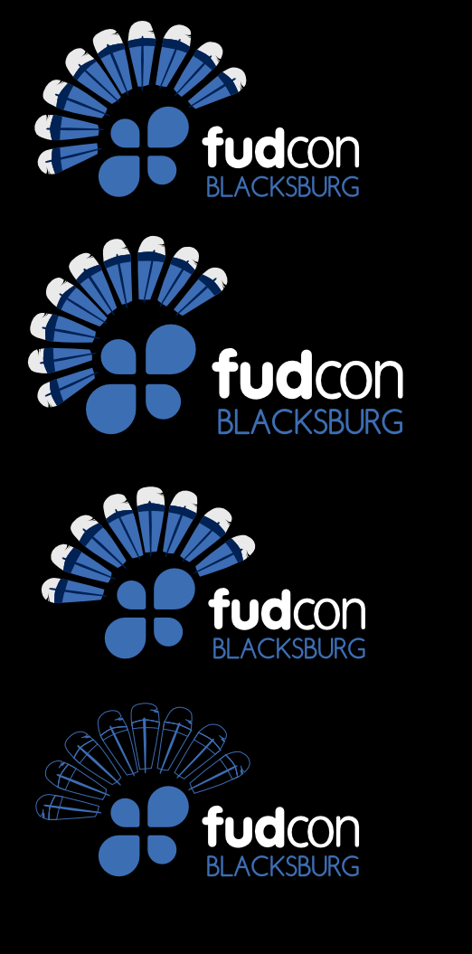
great work Kemter.

On Sat, Jul 30, 2011 at 4:31 PM, S.Kemter
<[email protected]>wrote:

> Hi,
>
>
> We searched for a idea for a logo FUDCon Blacksburg after last meeting.
>  And
> the idea came up to use a turkey. My idea was to use only a tail of one.
>
> Thats how it would look like.
>
> http://gnokii.fedorapeople.org/logo-blacksburg.png
>
> Is just a sketch so, colors are not 100% and the bubbles to, its fast
> vecotrized only to experiment with the position. My favorite is the third
> from
> top.
>
> The question is now, go with an full colored version or better with an
> outlined one, where I fear it have to bigger compared to the fudcon logo
> himself.
>
> So what are ur opinions?
>
>
> br gnokii
> _______________________________________________
> design-team mailing list
> [email protected]
> https://admin.fedoraproject.org/mailman/listinfo/design-team
>


--
Regards,
*Buddhike Chandradeepa Kurera*
Fedora Ambassador Sri Lanka
Event Liaison - Design Team
_______________________________________________
fudcon-planning mailing list
[email protected]
https://admin.fedoraproject.org/mailman/listinfo/fudcon-planning