Tim Čas <darkuran...@gmail.com> writes:
> He said that he'll fix those eyes shortly and contact the author of
> the "modern" logo, so it appears that both will get added!
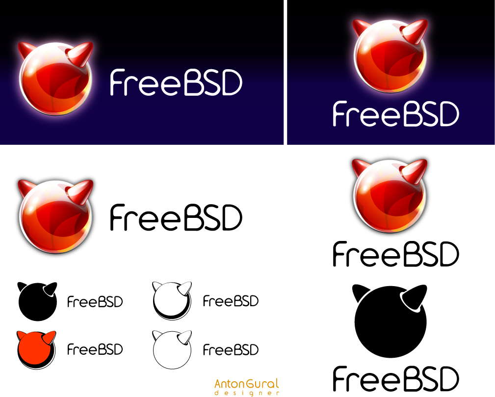
The author of the modern logo has vanished without a trace (before
delivering all the agreed-upon materials), but he doesn't own the rights
to it anyway - the Foundation does.

> In the meantime, any comments as to which of these should he use
> (n.b.: on the monochromatic variants are applicable here):
> http://www.freebsd.org/logo/logo-basic.png

I vote for the outline version, but with thicker lines.

However, I don't use Cherry keyboards - I use Logitech UltraX keyboards,
which have laptop keys - so I probably won't be able to use the caps...

DES
--
Dag-Erling Smørgrav - d...@des.no
_______________________________________________
freebsd-advocacy@freebsd.org mailing list
http://lists.freebsd.org/mailman/listinfo/freebsd-advocacy
To unsubscribe, send any mail to "freebsd-advocacy-unsubscr...@freebsd.org"