I've been playing with graphs for a long time.   Here is a dump of what I've
done and/or some comments about the current ntpviz.  Maybe something will be
useful.
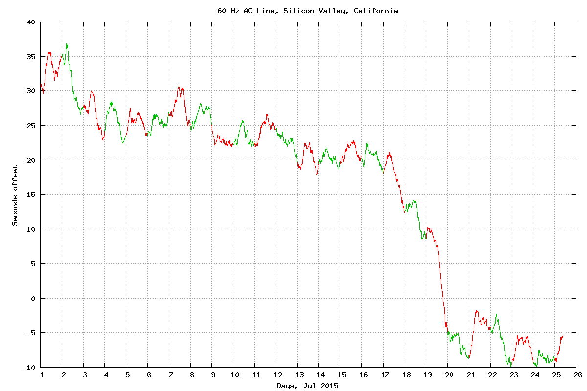
I have a script that uses rsync to collect the log files from various
machines.

Mostly, I plot 2 days, yesterday and as much of today as is available.

I have a script that sets up links from
  <name>-loop to <name>/loopstats-<today> and
  <name>-loop-1 to <name>/loopstats-<yesterday>
It has a cousin that sets the links up to target and day-before-target.

There are more kludgy scripts that split <name>-peer into <name>
-peer-<ipaddrss>

Then I use gnuplot to scan through a batch of graphs.  I have a top level
file full of things like:
  reset; load "xxx.gp"
  pause -1
where all the xxx.gp are setup by hand.  They don't change very often.
Occasionally I have to comment out one of the load/pause pairs because the
system generating the data is broken for all the time in the graph and that
kills gnuplot.

A lot of the graphs I'm interested in need two scales, one that shows
everything and another that ignores the outliers and shows the main stuff.
For those, I add something like:
  set yscale [xx:xx]; replot
  pause -1

I have a few graphs that are long running, months.  For those, I typically
use different colors on odd/even days, and another pair of colors for
alternate months.  Here are a couple of samples:
  http://users.megapathdsl.net/~hmurray/time-nuts/line/Calif-60Hz-2015-Jul.png
  http://users.megapathdsl.net/~hmurray/time-nuts/line/Calif-60Hz-2014-2015.pn
g

Some of the long running graphs need pre-processing.  I usually cache as much
of that as is convenient.

-------

Some of gnuplots colors are hard to see, at least on my setup with my eyes.
Yellow is the worst case.

Some graphs look better (to my eye) in points mode rather than lines.  You
have to be careful to pick a dot that is big enough to see.  Test to gnuplot
will show them along the right side.  I use the solid ones.

If a server is down for a while, the long straight line linking over that gap
looks ugly to me.

------

Using microseconds for everything is hard to read for long delays typical of
network links.  In bufferbloat cases, I see delays of several seconds.  I've
seen delays of 10s of seconds.  I can't count all those 0s quickly.  I think
milliseconds would be better.  (Looks like Gary tweaked things while I was
typing this in.)

The time labels on the X axis are hard to read on 2 day graphs.  The hours
that I want are hidden between day and minutes.  (I use 0-48, but I don't
have to worry about fractional day offsets.)

-------

You can monitor other servers by using noselect.  It sends packets and writes
rawstats and peerstats, then ignores the answer.  They show up in ntpq -peers
with a blank in col 1.

The round trip time is interesting, especially if you have a bufferbloated
DLS link.

There is a lot of interesting info in rawstats.  Some/much of it gets
filtered out on the way to peerstats.  It probably tells you more about your
network than your local ntp server.

If you assume that both your local clock and the server's clock are accurate,
you can get the network transit delay in each direction.  If you plot that
you can match steps in the round trip time with steps in a particular
direction.

There is interesting data in clockstats, at least for some drivers.  One of
the important ones is the count for the PPS driver.  It's real interesting if
your PPS pulse isn't wide enough to work all the time.

If you have a busy server, there is interesting stuff in usestats.


--
These are my opinions.  I hate spam.


_______________________________________________
devel mailing list
devel@ntpsec.org
http://lists.ntpsec.org/mailman/listinfo/devel