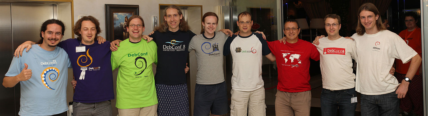
2012/3/5 Gunnar Wolf <[email protected]>

>
>
> Try to keep all designs with a maximum printout area of an A4 (US
> letter) area, minus ~2cm on each side. Also, each extra color/ink adds
> quite a bit of cost. The DC6 shirts were the most complex so far
> (printed with 6 layers of color, 4 of them needing submilimeter
> aligning). Before DC6 we had had 1 and 2 inks, and since DC7 we have
> always had 2 or 3 inks.
>
>
For reference: http://wiki.debconf.org/upload/a/a0/1500px-Debconftshirts.jpg
We can reduce one color if we play well with the T-shirt colors. OTOH, I
would really like to have some cool and different T-shirt colors (not the
ones from the logo palette).


> The DebConf12 logo is quite a challenge now, as it is already by
> itself five colors. At least two of them (tail+wing) can be "squished"
> down with very few people noticing. Possibly the dark-yellow head can
> be made with black dithering over the yellow, but not every printing
> technique allows for it.
>

I'll try to make a simplified version of the logo with less colors. The
problem is also that the bird itself is very colorful. :)


>
> Yes, I know the logo is already picked, but try to find a way to
> reduce its complexity... Maybe we could print its outline rather than
> each of its hues? I would suggest centering on the bird's head+swirl,
> but I know the tail is the distinctive item of the
> guardabarranco... So I'll try not to attempt to be creative, and leave
> the details up to you :)
>

Yes, that's a good idea! Maybe we can do the silhouette and scrap the
details?

Thank you Gunnar for your input! :)
_______________________________________________
Debconf-team mailing list
[email protected]
http://lists.debconf.org/mailman/listinfo/debconf-team